Component library
In progressComponents are authored in Figma Make alongside a Storybook implementation. The parallel tracks let design and engineering validate the same API surface before wider adoption.
Case study · Part two
Building in the open with Figma Make and Storybook, documenting for humans and agents, and shipping releases to npm.
Components are authored in Figma Make alongside a Storybook implementation. The parallel tracks let design and engineering validate the same API surface before wider adoption.
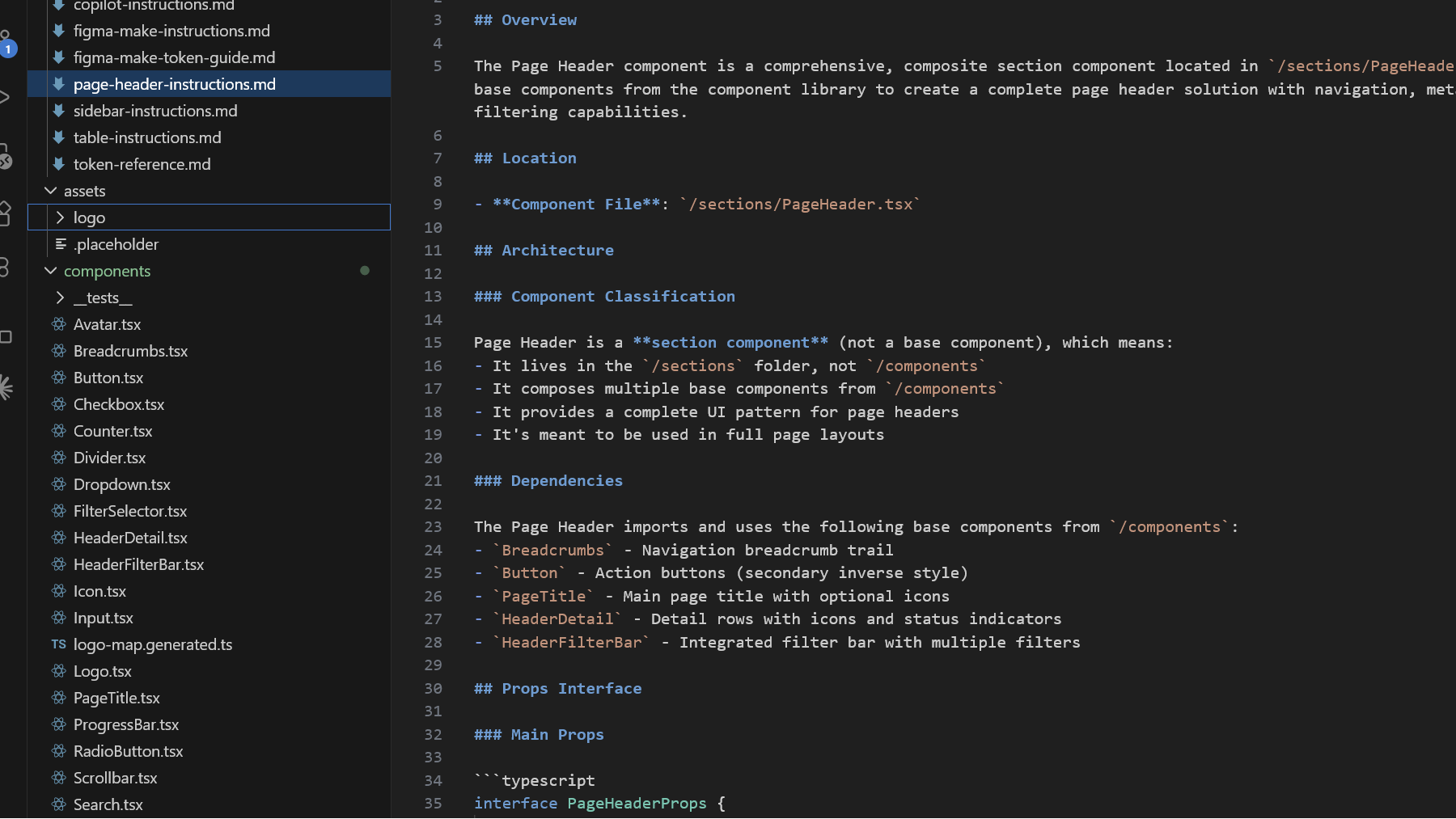
We added an instructions folder in the component repository so coding agents and contributors follow the same conventions, constraints, and review expectations.
CI builds, tests, and publishes the library so consumers can depend on a stable semver story. Install the package in your application toolchain:
npm install @nenad-spaceinch/component-library